RSS FEED

Showing posts with label photoshop 201. Show all posts

Sunday, November 29, 2015

posting curves.

This is photoshop 401.

What? You thought you graduated?


Please use this technique to recreate color that is specific.

I use my curve tool to its maximum limit.
Basically, if you have a car, you full speed max to the pedal. Non stop.

The first concept to understand when using curve tool is to use all adjustments.

There are 3 adjustments in curve tool.
Step 1 is to get out of normal.


don't be Normal!

know what you're choosing

Darken, Multiply, Color Burn... all those clustered are to darken pixels.
From Lighten to Lighter Color are lightening effects.
Overlay all the way to Hard Mix deals with contrast.
Rest is yours to explore.


Step 2 is the curve itself.
There are RGB, Red, Green and Blue channel.


changes are very delicate, because layer is no longer 'Normal'.
adjustment requires accuracy.  


with combined 4 layers,
changes no longer seem to be small.

The key is to use all 3 colors to adjust. 
While RGB channel seems perfect that controls all, it is easy for colors to add noise and/or reveal undesired color. 


notice the green between red and blue.
it is bridging the two, and thus therefore adjustment was needed.

The R,G and B-channel controls will balance the effect of the curve even further, resulting in much controlled color in your photography.
Consider this minute control as a support to your daily curve tooling.


Step 3 is masking. You decide where it should go. ;))

Wednesday, November 25, 2015

Pshop 301


In reality (industry/jobsite), you learn courses 101-303 at-the-same-time.

When you press (alt/opt. + click the 'create a new layer' button) you get the "New Layer" box.
There are more ways to get to this 'box'. Ask google.

Copy what I clicked.
My ex-NY photographer friend Taichi showed me this trick.


I created this 'Soft Light-neutral' layer to trick the computer. 

This is how it works. 


Layer (Neutral + Contrast = Nothing happens) + (burn'-n'-dodge tool) = Super-safe light-data quick Burn-n-Dodge layer that does not affect the pixel. It's an overcast. 

(**There are advantages and dis-advantages using any tricks. Please b smart)

Burn and Dodge tool affects pixel itself. This trick is to avoid direct interaction between the two. This trick is standard in some part of the industry. 

The advantage of Burn and Dodge tool is standard in retouching skins
It's the most delicate tool that has the versatility and ideal effect over pixels when recreating beautiful skin. 

 right image is brightened

compare and contrast
this is about 60-80% done


Usually, you would zoom to 400% and be using a wacom pen, at brush-size aligned to skin's each creases with strength 2-5% for burning, 5-10% for dodging ("It always burns faster").

That is for high-standard fashion and it takes x8-time to complete. 
For I-Don't-need-to-Cyborg photos, I only zoom to 200%, and would be using watevs that makes him look good. 


Tuesday, November 24, 2015

Photoshop 201


Did I give 101?

"My teacher said, it's all about the 'masking'."

Said the girl...

I'll mask you soft and hard. Get you excited, because it's twisted. That's Photoshop 101.

Photoshop 201 is putting layer on layer.
202 is putting layer on a layer on a layer.

Wow.

What does that mean?...

Let's explore...


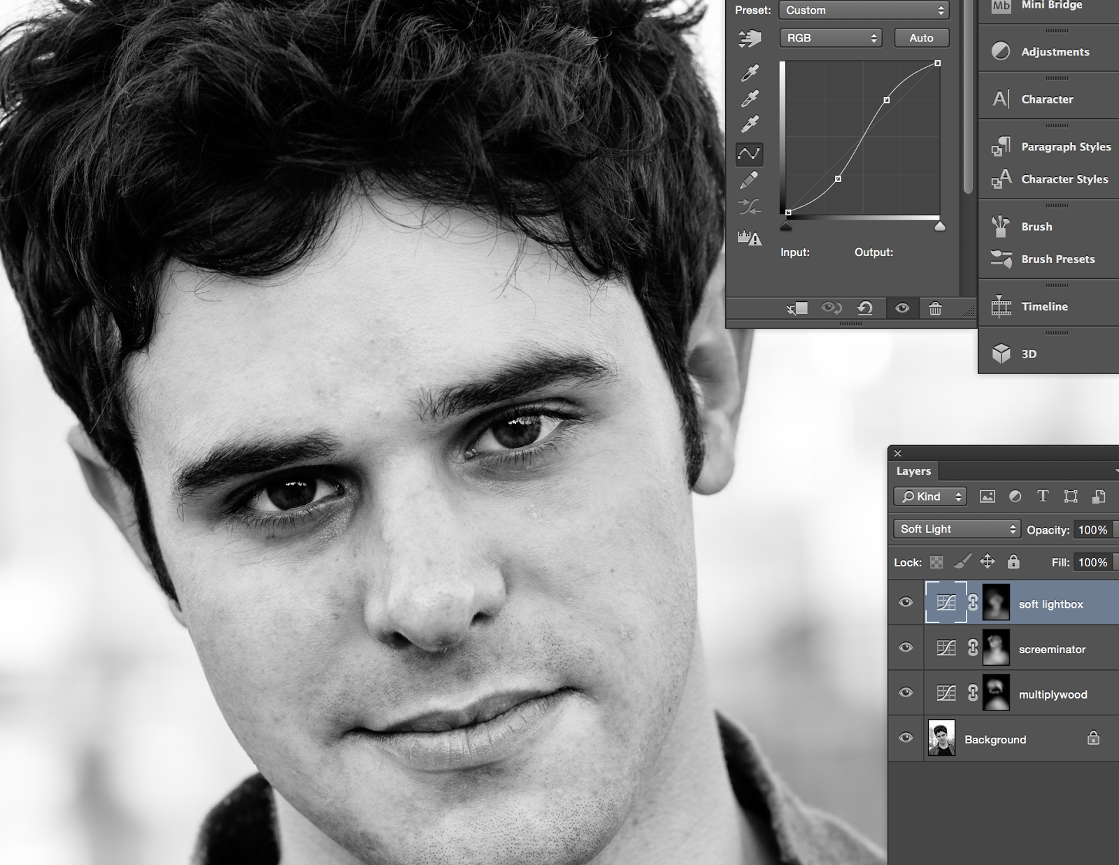
I made two layers here. Screen and Multiply.
both layers are untweaked.
ON: Opacity - 100%


This is Marc Iserlis.
He is an aspiring young actor hopping around NY and Asia and stuff like that.

I put my 'Curve' on 'Screen'.
(My Curve layer "screeminator" is switched to 'Screen' whereas its usually 'Normal'.)
((I usually use 3 layers. Darkening, lightening and contrast. as standard...))
Then I do changes on the 'Curve' tool.

I control the wave so that 'Curve Tool' makes sense. (bottom image: I put 2 control points on my curve tool wave thingy)
You're supposed to make curves, "Duh, get it?" Right, I got it.
...
..
.
Marc Iserlis
step 3 is precision and control. 

The third layer is 'Masking'.

You select what where when why who and mask the shit out of it. Make it happen.


...NEXT...


Friday, November 20, 2015

bw and colour

Marc Iserlis, 2015

Marc Iserlis, 2015

I'm doing portraits to expand my criteria. 

People need basic shots, so I give basic shots. 


I am posting my first "cutting-the-mountain-curve". 
My effort to balancing the skin-tone ended in shaving off some edge. Or perhaps de-contrasted some (skin)tone. 

color contrast


You can create contrast between presented colors by adding contrast in Saturation.

Color is 3-dimensional.
Hue, Saturation and Tone. Tone is Luminance.

Lets cut the complicated talk #crap and visually understand things.

The coordination of the points presented in the graph above tells you that it basically looks like wave.
This one will make Yellow color more 'pop' because the dudes next to him are shorter.

Then the BPM is the side gangs that also pops out head high.

That's contrast.

The deviation between Aqua and Blue dictates the emphasized contrast of Blue due to ooh jee sleeping time has approached........

good night.

Wednesday, August 5, 2015

Lombok House, Gerupuk, Indonesia
architect - Paula Hueta (Bambook Studio)


Photoshop becomes geekish.


When your curve is hitting the mirror of your mountain (histogram), it means something. 

It means I can cut time, work faster and better. 
I don't care the rest but it works out like its like the other you , trapped in you, trying to come out, so I mirror the pattern and somewhere in the color, that missing link comes back to you. In color. 

Oh that photo (mirror reality) had this much color (realness)!
Is the effect I end up with. 

Of course you cannot do consciously because each mountain (histogram) makes a different story. 
Sometimes it doesn't look like a double-helix. But just like dancing. 


Saturday, January 17, 2015

curves

I like to make my curves reflect color data. 

This is how you read computer. 
The white line controls the effect you want. The grey silhouette symbolizes the captured information in graph format. 
In 2-D scale, all you see is 'darks' and 'lights'.
In 3-D scale, we would additionally see 'hue' that determines colour. 

Curve tools are control format in 2-D scale. Up and down. Light and dark. 


This guy (picture) had a mountain full of information in the center (data in neutral grey tone). The zig zag creates a contrasty effect, but if you look at my white line, the curve reflects the grey mountain in the back.

What does this mean?


Now this one, I made it so my white line reverse-reflects the grey mountain.
It is hard to see in curves, so you can read the numbers below.


Actually, I'm not thinking while doing this, but rather just making the picture better-looking.
Somehow, the curve I cast reflects the grey mountain. And it feels extra good when it does.

It is peculiar to feel that something matters, or makes sense, when you tract it retrospectively... especially when it is not controlled.

It must be destiny, el-oh-el.

But if every image has their own destiny, maybe the curve can show a glimpse of their story, in their binary sense.

That catches my attention.